
Why Every App Is Slowly Becoming the Same App
In this article
- Section 1: The Subtle Convergence of Modern Apps
- Section 2: Why Design Decisions No Longer Belong to Designers
- Section 3: Algorithms as the New Editors of Digital Life
- Section 4: The Economics Behind Interface Uniformity
- Section 5: When Engagement Metrics Dictate User Experience
- Section 6: What We Lose When Every App Feels Familiar
- Section 7: The Bottom Line
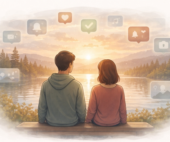
Why apps feel the same is not a failure of creativity, but the outcome of design decisions shaped by metrics, algorithms, and the economics of attention.
Modern software rarely announces these forces, yet they quietly dictate how we scroll, pause, and move forward.
What appears as convenience is often the result of careful optimization, repeated across platforms until difference becomes inefficient.
To understand this shift, we need to look beyond individual apps and examine the patterns they now share.
Section 1: The Subtle Convergence of Modern Apps
There was a time when software felt distinct.
You could sense the difference the moment you opened an application—how it behaved, how it asked for attention, how it respected (or ignored) your time.
A music player felt nothing like a writing tool. A news reader did not behave like a messaging app.
Each product had a purpose, and its design reflected that purpose clearly.
That distinction is fading.
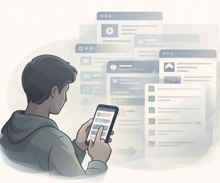
Today, many apps—regardless of what they claim to do—operate on the same underlying patterns.
The content scrolls endlessly. New information is revealed through swipes rather than deliberate choice. Notifications interrupt instead of inform.
Interfaces are designed to keep users moving forward, rarely encouraging pause or completion.
This similarity is not accidental, nor is it the result of creative laziness.
It is the outcome of a shared set of assumptions about how people should interact with technology.
Modern apps are increasingly built around the idea that attention is fragile, time is scarce, and users must be guided continuously to remain engaged.
As a result, different categories of software begin to resemble one another.
Productivity tools borrow patterns from social platforms. Educational apps adopt engagement loops once reserved for entertainment.
Even utility software now nudges, reminds, and prompts, often without being asked.
What we are witnessing is not innovation moving forward, but design collapsing inward—toward a small number of interaction models proven to retain users.
The experience may feel familiar, even comfortable, but it also signals a loss of diversity in how digital tools are imagined and used.
This convergence forms the foundation for everything that follows.
To understand why apps behave the way they do today, we must first recognize that they are no longer built to be different—they are built to be effective in the same way.
Section 2: Why Design Decisions No Longer Belong to Designers
In theory, design is about intention.
Designers are trained to think about usability, clarity, restraint, and human behavior.
They study how people read, react, hesitate, and decide. At its best, design is a careful balance between function and empathy.
In practice, however, modern software design rarely operates in isolation.
Today, many design decisions are no longer made at the designer’s desk.
They are shaped elsewhere—inside dashboards, performance reports, and growth meetings.
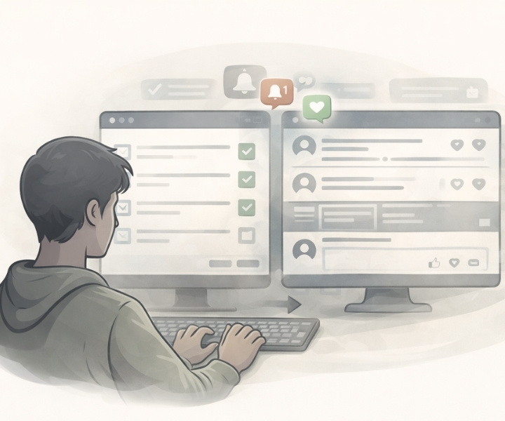
Interfaces are adjusted not because they feel better, but because they perform better under measurement.
A button moves because it increases clicks.
A screen changes because users stay longer.
A feature survives because it boosts retention.
Over time, these micro-adjustments harden into rules.
Designers are asked to “optimize” rather than imagine.
Instead of asking what experience makes sense, the question becomes what keeps users active.
Creativity narrows. Risk becomes expensive. Familiar patterns feel safer than thoughtful experimentation.
This shift explains why so many apps feel interchangeable.
When decisions are driven by the same data models, the outcomes naturally converge.
The most “successful” patterns are copied, repeated, and standardized across products and industries.
Design, in this environment, becomes less about shaping experience and more about fine-tuning behavior.
The human element remains, but it is increasingly filtered through metrics that reward immediacy over depth and repetition over meaning.
As a result, designers are no longer authors of interaction—they are translators, converting business goals into visual cues.
The interface may look polished, but its priorities are quietly decided elsewhere.
This loss of ownership is subtle, but its impact is profound.
When design stops leading and starts following numbers, software begins to resemble itself—again and again.
Section 3: Algorithms as the New Editors of Digital Life
In the past, software responded to explicit user intent.
You searched, clicked, chose, and navigated. Content appeared because you asked for it.
The system waited for instruction, and control—at least in theory—remained with the user.
That relationship has inverted.
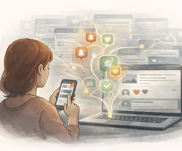
Today, algorithms decide what appears first, what is hidden, and what is repeated.
They prioritize content, reorder information, and subtly guide attention without ever announcing their presence.
In effect, they have taken on a role once held by editors, curators, and even personal judgment.
But unlike human editors, algorithms do not evaluate meaning.
They evaluate response.
What you:
- pause on
- Sroll past slowly
- Return to—even unintentionally
From these signals, software learns what to surface next.
Over time, this process becomes self-reinforcing.
The algorithm promotes what performs well, performance improves through exposure, and diversity quietly disappears.
This editorial power explains why apps across categories begin to feel the same.
Whether the content is news, entertainment, education, or utility, it is filtered through the same logic: maximize interaction, minimize friction, sustain attention.
As a result, chronological order fades. Completeness becomes irrelevant. Context gives way to momentum.
The user does not move through content deliberately; content moves toward the user continuously.
What makes this shift particularly influential is its invisibility.
Most users are not aware that decisions are being made on their behalf.
The interface appears neutral, even helpful, while actively shaping what feels important, urgent, or worthy of time.
In this model, software no longer merely delivers information—it curates reality at scale.
And because the same algorithmic principles are reused everywhere, the experiences they generate begin to look uncannily alike.
Different apps.
Different promises.
The same invisible editor.
Section 4: The Economics Behind Interface Uniformity
Behind every interface is a business model.
While apps present themselves as tools, platforms, or services, they operate within economic constraints that shape how they look and behave.
Most modern software is funded by attention—either directly through advertising or indirectly through engagement-based growth metrics that attract investment.
In such an environment, predictability is valuable.
Interfaces that users already understand require less explanation, fewer onboarding steps, and lower drop-off rates.
Familiar patterns reduce friction, shorten learning curves, and increase the likelihood that users will stay long enough to be measured, tracked, and monetized.
Uniformity, therefore, is not a design failure. It is a rational economic outcome.
Building something genuinely different is expensive.
It requires experimentation, user education, and tolerance for short-term losses.
In contrast, adopting proven interaction models offers a safer path to growth.
The risk is lower. The results are easier to justify. The metrics are more reliable.
This logic scales quickly. As successful patterns spread, investors expect them. Stakeholders recognize them.
Teams replicate them. Over time, deviation starts to look irresponsible rather than innovative.
Even subscription-based apps are not immune. Retention remains critical. Engagement still signals value.
The pressure to keep users “active” persists, regardless of how revenue is collected.
What emerges is a market where diversity of experience is quietly sacrificed for financial stability.
Apps begin to resemble one another not because creators lack imagination, but because economic incentives reward sameness.
The interface becomes optimized not for clarity or calm, but for continuity—keeping the user moving, responding, and returning.
In this context, uniform design is less a creative choice and more a financial strategy.
And once economics set the direction, design follows.
Section 5: When Engagement Metrics Dictate User Experience
What cannot be measured is slowly ignored.
Modern software development revolves around metrics that are easy to track and compare: time spent, clicks, scroll depth, daily activity, and return frequency.
These numbers promise clarity. They appear objective, actionable, and scalable.
But they also simplify complex human behavior into signals that software can react to automatically.
When engagement becomes the primary indicator of success, experience is shaped to maximize measurable interaction rather than meaningful use.
Features that encourage frequent checking are favored over those that support completion. Systems reward repetition, not resolution.
This explains why so many apps resist endings.
Feeds rarely conclude. Tasks loop instead of finish. Notifications reappear even after being dismissed.
The goal is not satisfaction, but continuity—keeping the user within the system long enough to register as “active.”
Over time, this focus changes how software behaves at a fundamental level.
Instead of helping users achieve something and step away, apps encourage constant presence.
Moments of pause are treated as failures. Silence becomes something to correct.
Designers, working within these constraints, optimize what they are asked to optimize.
If increased engagement is rewarded, disengagement—even healthy disengagement—is invisible in the data.
As a result, software becomes excellent at holding attention and poor at respecting it.
The interface feels responsive, but rarely considerate.
Every interaction is engineered to produce another interaction.
When metrics define success, experience becomes secondary.
The system may appear efficient, but its priorities are clear: stay longer, respond faster, return sooner.
This is how intention disappears quietly—not through malicious design, but through numbers that reward only what they can see.
Section 6: What We Lose When Every App Feels Familiar
Familiarity feels efficient, but it comes with a trade-off.
When apps converge around the same interaction patterns, users lose more than novelty.
They lose alternative ways of thinking, working, and deciding.
Software stops challenging behavior and instead reinforces it.
Different tools once encouraged different modes of attention. Some demanded focus. Others allowed wandering.
A few required patience. That variety mattered. It shaped how people approached tasks and information.
Uniform interfaces flatten those differences.
When every app scrolls, nudges, and interrupts in similar ways, the user adapts by defaulting to passive consumption.
Intentional use becomes harder, not because users lack discipline, but because the environment no longer supports it.
This sameness also reduces trust. When productivity tools behave like entertainment platforms, their purpose becomes unclear.
When educational apps borrow attention loops from social feeds, depth feels optional.
The boundary between tool and distraction erodes.
Creativity suffers quietly in this environment.
New interaction models struggle to survive long enough to prove their value.
Anything unfamiliar risks lower engagement in early stages and is often abandoned before it can mature.
Over time, users internalize these patterns.
They begin to expect constant stimulation, immediate response, and endless availability.
Software trains behavior, and behavior reshapes expectation.
What is lost is not efficiency, but intentionality.
Technology stops feeling like something you use and starts feeling like something you inhabit.
When everything feels familiar, nothing feels considered.
Section 7: The Bottom Line
The reason apps feel the same is not a mystery.
They are shaped by the same incentives, measured by the same metrics, and optimized toward the same outcomes.
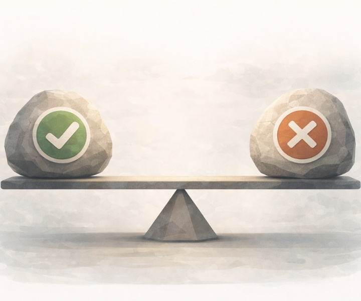
Uniformity is not the result of bad design.
It is the result of design being asked to serve numbers before people.
As long as success is defined by engagement alone, software will continue to converge.
Interfaces will prioritize continuity over clarity, motion over meaning, and familiarity over thought.
The experience may feel smooth, but it will rarely feel deliberate.
A different path is possible—but it requires redefining what “success” means.
It requires software that values completion as much as retention, restraint as much as activity, and trust as much as time spent.
Until then, most apps will keep evolving in the same direction, regardless of what they promise to be.
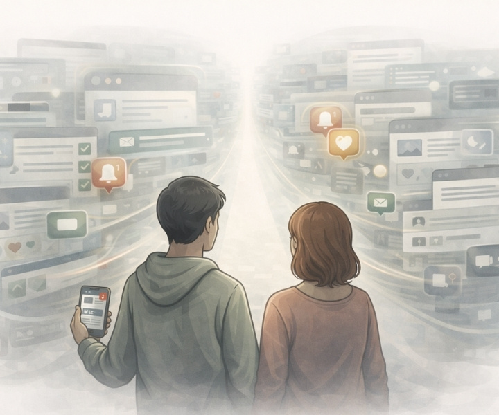
Different icons.
Different names.
The same experience.
Modern apps do not feel the same by accident.
In that pursuit, variety becomes inefficient and restraint becomes risky.
What survives is not what serves users best, but what performs best under metrics.
Until software is allowed to value clarity over compulsion and completion over continuity, innovation will remain cosmetic.
The future will look polished, familiar—and increasingly interchangeable.